Disclosure Triangle of Sadness
13 January 2023
One of the advantages of not being a full-time iOS app developer is that I can spend an unreasonable amount of time on minuscule details of app design. Paying attention to the details is important and a sign that you care — but it’s rarely noticed nor rewarded by others, while shipping something that works is. In any case, sweating the details is a luxury I can afford now, which brings me to a UI design curiosity of Apple’s that sent me down a rabbit hole. Consider the empty tab page on Safari:
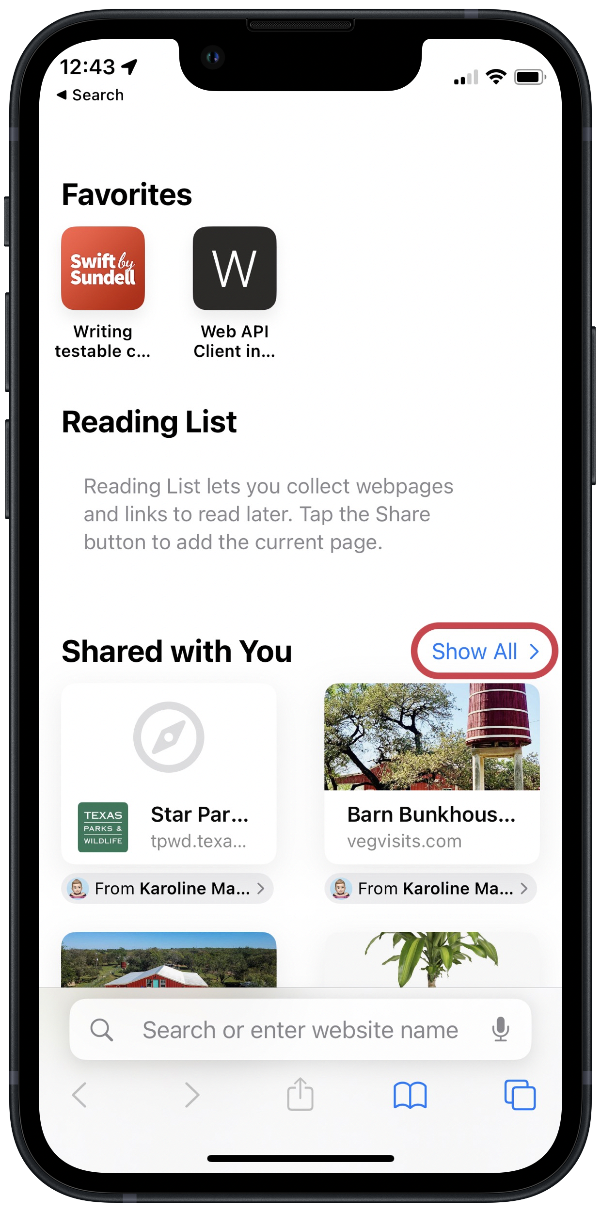
I’ve circled the disclosure control next to the ‘Shared With You’ section that lets you expand and show more items. Now consider the same New Tab page on iOS Safari:
On the Mac, the control for expanding ‘Shared With You’ is a downwards-pointing chevron; it becomes upwards-pointing when you expand it. On iOS, it is downwards-pointing after you expand it, while it points to the side when the section is collapsed.
The first thought that came to mind when I noticed the different direction of the disclosure links was Gruber’s post on what disclosure controls ought to do:
In the iOS/Mac style, a right-pointing chevron (or triangle, depending on the OS) indicates the collapsed state, and a down-pointing chevron indicates the expanded state.
Based on that article, I thought I had found another instance of Apple’s own apps not following the HIG, but that isn’t the case. Based on my reading of Apple’s HIG, this control is a disclosure button on the Mac, but a disclosure link on iOS. Now I have two questions:
- Why do disclosure links show state and imply action while disclosure buttons show action and imply state?
- Why is it a button on the Mac and a link on iOS?
I feel like there ought to be a clear answer to the first one, but the examples in the HIG don’t elucidate the differences to me. Regarding the second question, I think its a mistake by whoever designed it. Disclosure links are all over macOS and they do exactly what this disclosure button in Safari does: expand a list of items to show more. Why should this control be different?

